


This is the first in an ongoing series we're calling Lab Notes — the technical work behind the work. Not polished case studies. The actual problems, the wrong turns, and what we'd do differently next time.
We'd been using Client-First for a couple years before we admitted the problem wasn't Client-First. It was us.
Three of us build in Webflow at any given time, and the same project, given to two different people, was coming out different. Not wrong, exactly. Just different enough that a client project felt like it had been handed off mid-build, even when it hadn't. Different container widths. Different ideas about what belonged as a dedicated class. One team member's "padding-medium" was another's "padding-32." Client-First gives us the vocabulary to talk about a Webflow build, but it doesn't tell us which of its own options to pick, and it turns out that's exactly the kind of decision three people will make three different ways without ever realizing they're diverging.
So we built our own version with fewer choices. This is the record of doing that, including the parts where we got it wrong the first time.
What Client-First still gets right
We didn't throw the whole thing out, and here’s why. Core Structure — the section, padding-global, container, padding-section nesting pattern — is genuinely good architecture, and rebuilding it from scratch would have been for vanity. Same with the naming syntax itself, block_element and is-variant and the rest. It's a known standard at this point. There's no upside to inventing our own dialect just to feel ownership over it.
What we actually had a problem with was everything Client-First leaves open on purpose, because it's built for every kind of Webflow project, not specifically for ours. How many container sizes. How granular utility classes get. Every one of those is a decision, and every one of those decisions was being made differently depending on who sat down to build.
Locking it down
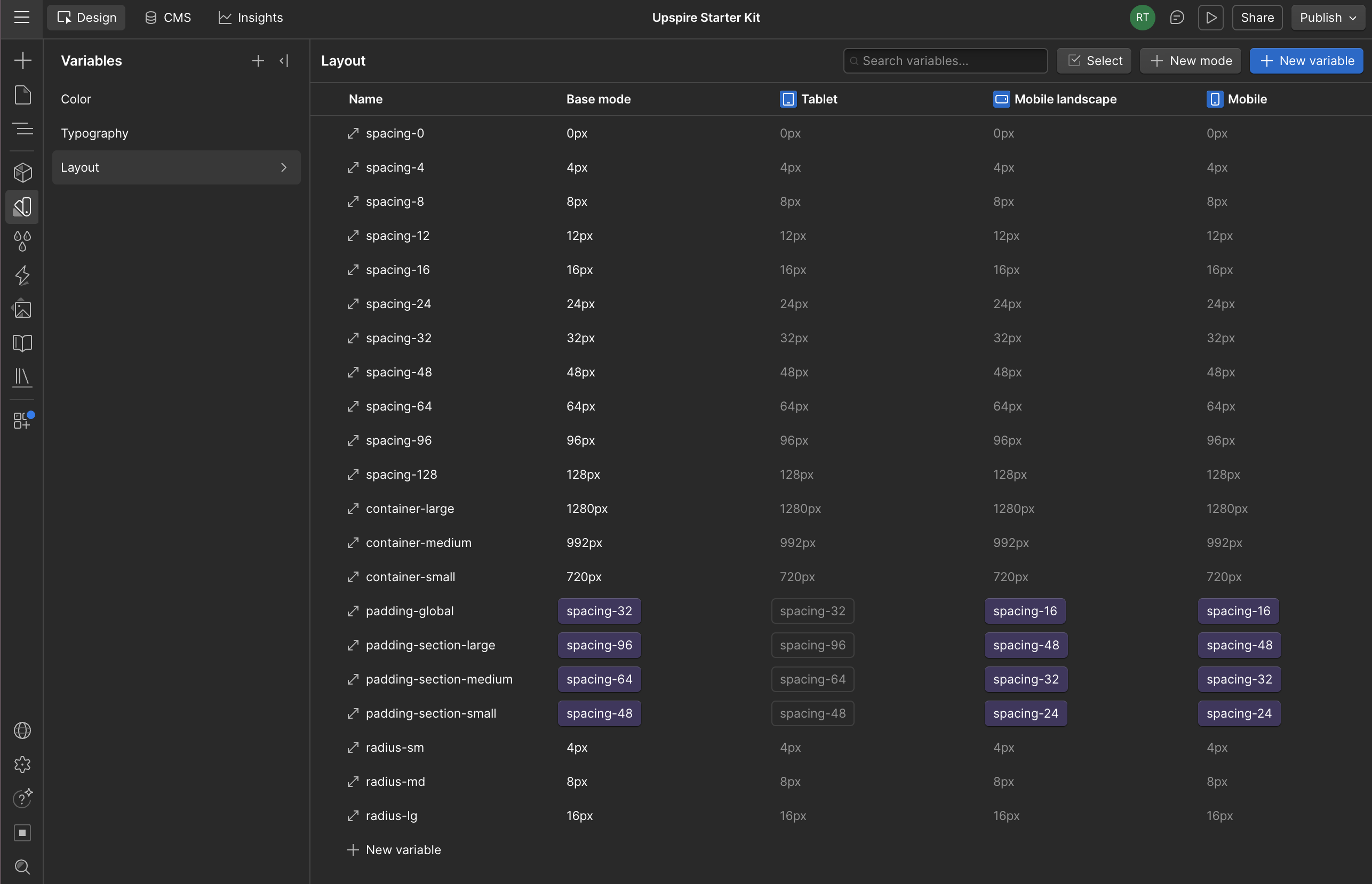
The fix ended up being almost boring: pick one answer for everything that used to be a choice, and write it down somewhere nobody has to remember it from memory. Three container sizes instead of four or five. A fixed 4-point spacing scale — 4, 8, 12, 16, 24, 32, 48, 64, 96, 128 — with a rule that if a layout needs a number outside that list, the layout is wrong, not the scale. Two section padding sizes to start, though we ended up adding a third partway through once we actually felt the gap between them.
This approach isn't overly complex—it simply reduces the available options. Limiting choices proved far more impactful than anticipated. The lack of consistency was never due to poor documentation. Instead, variations arose from thoughtful, independent decisions. The true solution lies in eliminating unnecessary choices rather than attempting to write clearer guidelines for them.
Building it as tokens, not just a naming convention
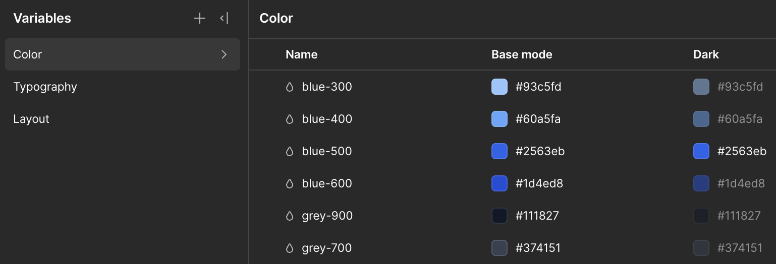
Here's the part that took the system from "a naming convention" to something that actually saves time on every future project: instead of hardcoding a hex value into every button and heading, we built three layers. Primitives are the raw values — blue-500, gray-900, nothing that means anything on its own. Semantic tokens sit on top and reference a primitive by role — brand-primary points at blue-500, text-heading points at gray-900. Component tokens, if you need them, sit one layer further — button-background pointing at brand-primary.
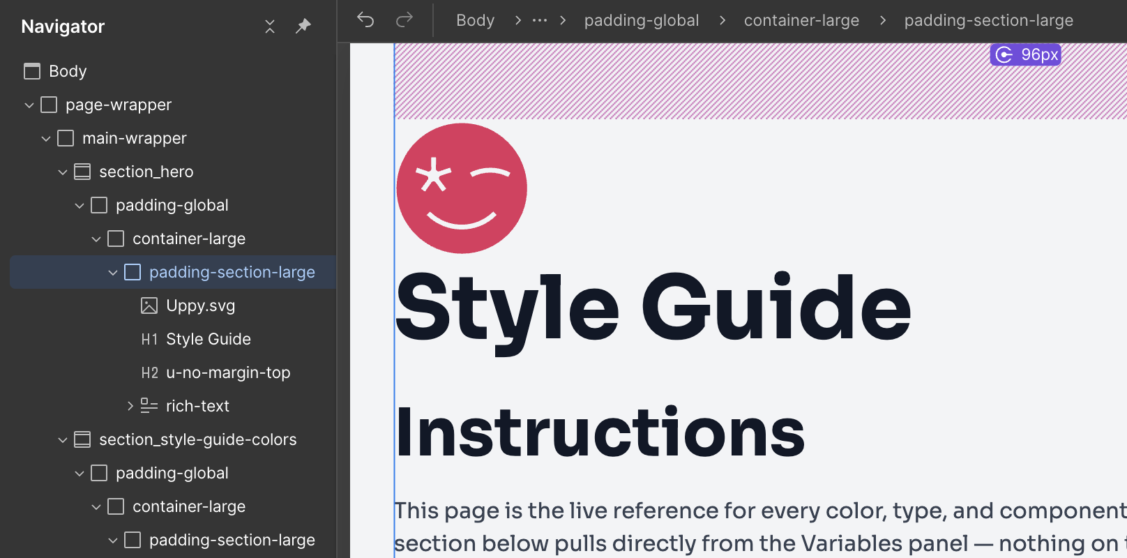
Why this matters: every component has to reference a semantic or component token, never a primitive directly. Do that consistently, and reskinning a project for a new client's brand becomes changing a handful of primitive values in one panel instead of hunting through every component for a hardcoded color. We built a Style Guide page as the live proof of this — swatches, type scale, buttons, all pulling from the same variables — and the actual test of whether the system works is changing one primitive and watching everything downstream update without touching a single component.
It worked. The first time we ran that test — swapped a blue for orange just to see — every swatch aliased to it updated on its own. That was a satisfying moment, more than it probably should have been for changing a hex value.
Dark mode, almost for free
This part I didn't expect when we started. We needed a way to handle sections that flip to a dark background — not a whole dark-mode toggle, just individual sections within an otherwise light site, which is a much more common design scenario than people probably realize. The thought would be to build a parallel set of "dark" classes, or manually overriding color on every element inside a dark section by hand.
Webflow's Variable Modes solved this in a way that felt almost too easy once it was working. You give your semantic tokens a second value under a "Dark" mode — text-heading becomes white instead of near-black, surface-default becomes near-black instead of white — and then you apply that mode to a single wrapper class. Everything nested inside just asks for text-heading like it always does, and it resolves differently depending on which part of the page it's in. No more combo classes on every heading or buried JavaScript. We tested it out by building an actual CTA banner component with a dark background which meant the proof and the deliverable ended up being the same thing in our style guide.
Where it actually broke
I don't want to make this sound cleaner than it was, because most of the real learning happened in the parts that didn't work the first time.
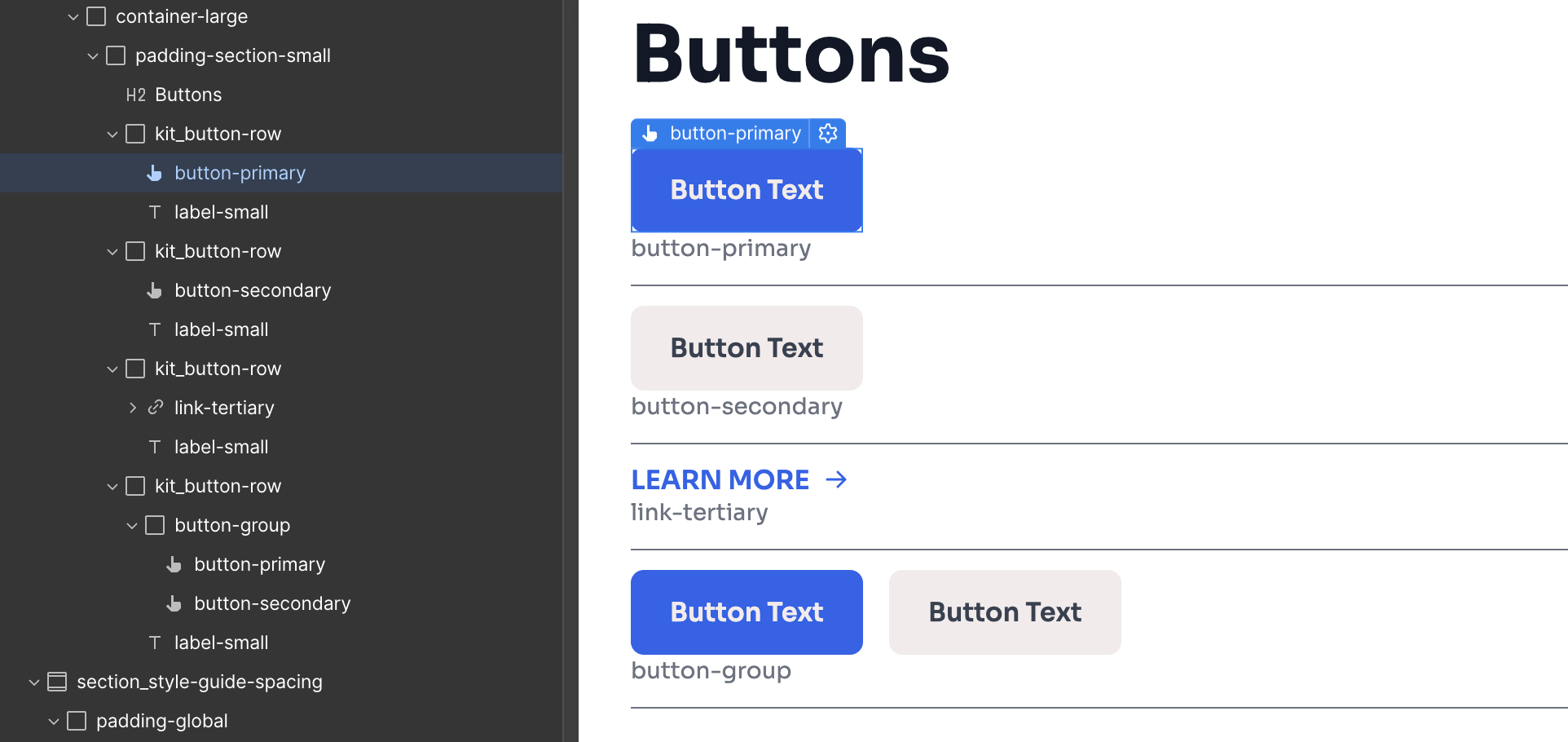
The button hover states were the first real bug. We had everything correctly linked to our variables, but the text color wasn't flipping when we hovered over the elements. We realized this wasn't a logic error, but a configuration issue: we hadn't set the variables to update on hover. The logic was there, but the specific tokens for those interactions were missing, which meant the buttons just stayed static even though the rest of the architecture was technically sound.
There was a similar issue with heading margins stacking on top of section padding — an H2 with its own top margin, sitting inside a section that already had 96 pixels of top padding built in, produces a section that looks lopsided, more space at the top than the bottom, for no reason anyone would guess just by looking at it. Margin and padding don't collapse into each other the way you'd hope. The fix was a small utility class to zero out that margin specifically when a heading happens to be the first thing in a section — not elegant, but honest about the actual constraint.
What's still ahead
The token layer is done and it's held up under real testing. What's left is the actual component library — thirteen pieces, from Hero through the CMS collections for case studies and blog posts, plus form inputs, which haven't been touched yet. We're also going to convert buttons into real Webflow Components with variants once the shape of the system stops shifting, which felt premature to do while we were still discovering edge cases.
The actual measure of whether this was worth building isn't going to be this post; we'll be publishing a follow-up post shortly that demonstrates how this system held up during a real-world client sprint.